

Klare Sicht voraus.
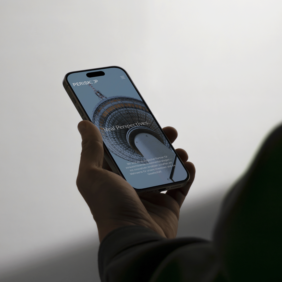
Periskop Partners, früher bekannt als DLE, hat sich zu einer facettenreichen Investment-Plattform entwickelt und verwaltet über 2,2 Milliarden Euro Vermögen in Deutschland und Polen. Aus einem Entwicklungsspezialisten wurde eine strategische Investment-Plattform, und die Marke brauchte eine neue Identität, eine, die Weitsicht, Stabilität und Partnerschaft ausstrahlt. Der Name Periskop steht für die Fähigkeit, Werte zu erkennen, wo andere Risiken sehen.
Die Branche
Real Estate & Investment
Die Herausforderung
Periskop Partners – früher bekannt als DLE (Deutsche Landentwicklung) – war als Entwickler bereits hoch angesehen. Doch der Name wurde angefochten — und der Auftritt spiegelte nicht mehr wider, wofür das Unternehmen heute steht.
Das Ergebnis
Seit dem Rebranding positioniert sich Periskop Partners erfolgreich als zukunftsorientierte Investment-Plattform. 2025 wurde das Unternehmen vom REB Institute mit dem Brand Diamond for Growth in Resilience ausgezeichnet – mit einem Markenwachstum von über 15 % in seiner Kategorie.


Die Umbenennung von DLE in Periskop Partners war mehr als ein Rebranding – es war ein strategischer Neustart.Die neue Marke schlägt die Brücke zwischen Tradition und Zukunft: Sie bewahrt Glaubwürdigkeit und öffnet zugleich den Blick auf internationale Märkte und Partnerschaften.


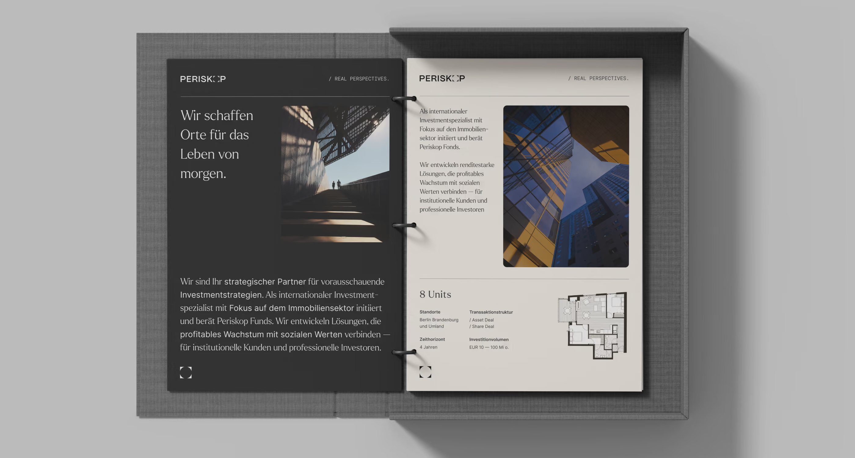


Sehen, was andere über-sehen.
Kunde
Periskop Partners AG
Projekt Team
Klara Hieronimus
Dorothea Baumann
Cosima Schütze
Deborah Sjoukes
Jonathan Robrecht
Collaborators
Mehr Cases
Lust auf weitere Cases?
There you go!

Wie geht es weiter?
Das war erst der Anfang. Gerne stellen wir Euch ein maßgeschneidertes Portfolio zusammen.
Unsere Brand-Agentur wurde 2018 gegründet. Aktuell sind wir ein Team aus 16 Branding-Expert:innen. Insgesamt haben wir bereits über 100 Markenprojekte umgesetzt.
